View Data as a Visual Graph (Quantitative Rendering)
The Quantitative Rendering tool is a great way to view data graphically over a large area. You can choose to graphically view data in terms of:
Parcels Latest Sale Price
Parcels Land Value
Parcels Improvement Value
Parcels Total Assessed Value
ZIP Code Areas Population
Precincts Population
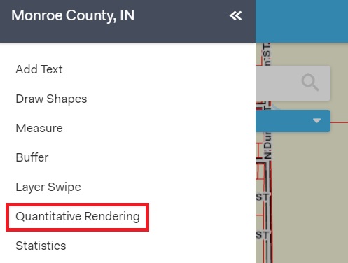
To access the tool, first click Menu in the top left corner of the screen, then click Quantitative Rendering.

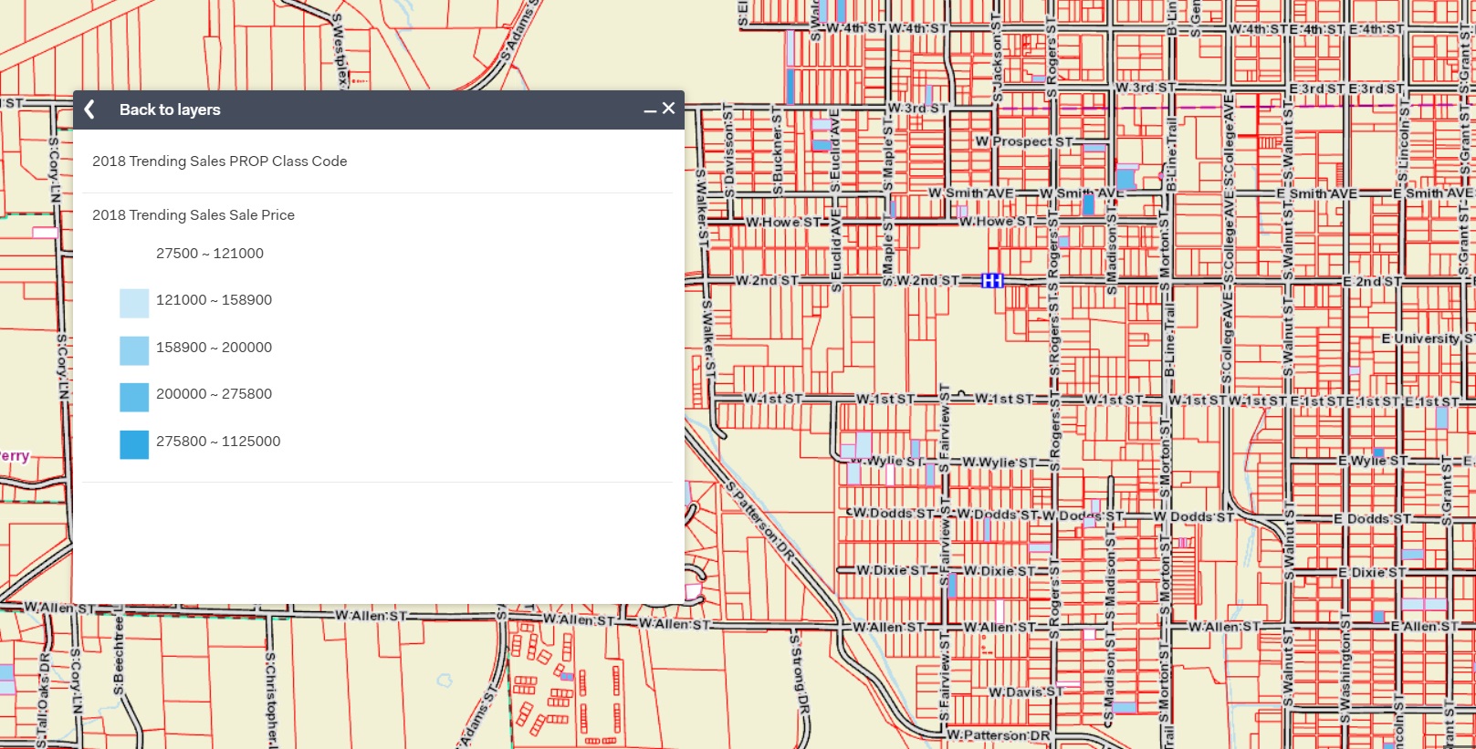
A pop-up box will appear. To begin using the tool, hover over one of the options then click "Show" that will appear at the right of the tool. Your map will automatically change to match the colors that represent each set of data in the pop-up window.

To stop showing the colors on the map, hover over the tool you selected and click "Cancel" at the right.
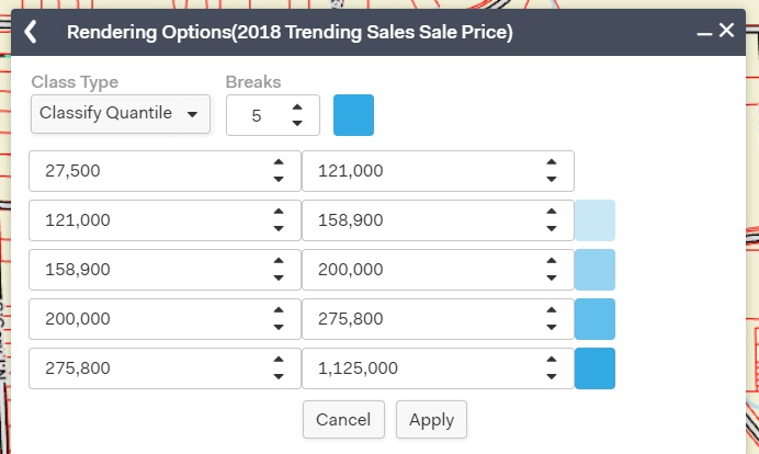
You can change the number of breaks in the data, the way the data is broken down, and the colors on the map. To make these changes, click on the name of the tool you selected (such as Parcels Latest Sale Price).
To change the way the data is presented click on the Class Type and choose the way you would like the data to be represented on the map.
You also have the option to make other edits to your data by selecting the options from the drop down menus, using the arrows to adjust the numbers, or manually typing numbers into the boxes. You can change the colors by clicking on them and choosing a new color.
To save your changes, click "Apply" at the bottom. To go back to the main tool, click the back arrow in the top left corner of the pop-up window. To cancel, click "Cancel" at the bottom or the "X" in the top right corner of the window.
